Tuesday, May 5, 2015

Correction-8

Photographer: Kristine Ridley
Location: USA

Kristine was able to take a very special moment and emphasize the emotion in it. By correcting the colors and working with levels, shadows and highlights, she was able to put more focus on the bride and grooms face, whereas in the before-photo their faces weren't grabbing enough attention. Color editing really allowed for more emotion to show through since we can now better see the looks on the models faces. The environment of the photo also now has a more magical, warm feel to it whereas it didn't before. I especially love the color editing on the leaves that are up close and out of focus. Kristine utilized this small element to her advantage and created a more lively feel in the after-photo.
divergence

Photographer: Thomas Leth-Olsen
Location: Hamar, Norway

Divergence can sometimes be tricky to capture, but Olsen has done a beautiful job in the most simplest way possible. To me, this photo says "take the road less traveled." Olsen captured the shot at just the right time when a light dusting of snow covered the curved tire tracks, representing that not everyone takes that path, such as the straight tire tracks that are completely cleared of snow. It's the simple things that can be the most impacting, and Olsen was able to combine a big message with an easy-to-understand shot.


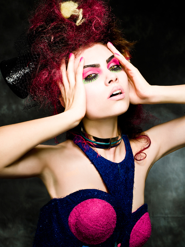
Photographer: Candy Kennedy
Location: Studio

With such a bold choice of colors, makeup, hairstyle and outfit, this photo is packed with visual interest that is sure to draw the eye. Even though this photo is striking on it's own, I chose it because the model has her hands in the photo. Incorporating your arms/hands in a model shot is a great and natural looking solution to increase interest. It adds more content for the viewer to take in and examine and adds complexity without actually getting too complex and busy.


Photographer: Antonio Mendoza
Location: Unknown

I love that Mendoza created visual interest with the background but it's subtle enough to not take away the attention from the products. The faded Banana boat logo in the background reinforces the brand and has the potential to subconsciously imprint itself into the viewers mind. Though I like the subtle elements in the background, I think this product shot could do without the "light streak" (or whatever it is) that's to the left of the products. The faded logo in the top right and the left side (it's larger) of the shot is enough to create an effective element. The "light streak" just seems unnecessary.

garnier product shot by tarynward


Photographer: Taryn Ward
Location: Unknown

I'm not sure if I'm a fan of the bulls eye circles around the product. It seems too harsh and seriously distracts from the product itself, which is a huge problem when you're doing a product shot. The black circles draws your eye away from what's important and creates a distracting visual that steals the focus from the product. If Ward still wanted to use something similar to the black circles to create visual interest, I would create the same black half-circle element that's on the product and surrounds the brand name. At least that way it wouldn't look so out of place and the elements would tie together more nicely than the harsh black circles.

Photographer: Brenton Cleeland
Location: Unknown 

This product shot isn't the greatest. It doesn't look appetizing or appealing, and certainly doesn't make me want to drink the soda. For starters, the name "Coca-Cola" should be what's highlighted. Coca-Cola is widely known for their soda, so people will understand right off the bat what this product is when they read the name. I'd also give the product a little more headspace and the background could stand to be a white instead of a poorly lit gray. The top of the can is a little too dark and that glare on the 3 of the "375 mL" is quite distracting. 


Photographer: Arne Roslund 
Location: Florida

Being able to re-create sections of a photo is amazing; it brings back the integrity and vitality of the photo, and is able to create more visual interest for the person who has the memory of the moment. The original photo is in terrible shape, so it must have been tough trying to recreate the areas of her hair and dress. Her dress looks a little on the fake side, but I suppose the photographer did the best they could do considering the old photo had no reference to the dress since it's so damaged. The photographer did a wonderful job of making the woman's skin more radiant and lively as well as bring out her beauty and whitening her smile. It almost looks like a modern day photo with a simple vintage filter over it.