Monday, May 4, 2015


Photographer: Scott Hancock
Location: Utah, U.S.

This photo restoration is stunning to say the least. Scott was able to enhance an older moment in time, while still keeping the integrity of the memory intact. Getting rid of the tear going straight through the middle of the photo was the biggest eye sore to take care of, and Scott did it flawlessly. There's no trace of the tear ever being there, and now we can see the little kids face clearly.  The weird white smudges on the photo were also a much unwanted element, Scott smoothed it out completely while still keeping the pattern of the house the same and saving the father's face. After a little work with levels and shadows/highlights, this photo was given new life after the washed gray scheme of the old photo was replaced by the more eye-catching and satisfying combination of whites, blacks and grays in the newly restored photo.


Photographer: Chris Havron
Location: United States

The way that Havron arranged the shoes strengthens the idea of casualness and a laid back lifestyle while still keeping a hint of class and stylishness. His use of light easily captured the texture of both the side and the bottom of the shoe, helping the product look more realistic and detailed. Even though it's a light colored shoe, I'm glad Havron went with a white background. To me, it accentuates the feeling of "fresh style" in a lightweight, casual sneaker and makes the product as a whole look sharp and clean.

Photographer: Gord Heatley
Location: Unknown

I love how dainty and light this photo feels. This fragrance is definitely a classier one, and Heatley was able to capture that feeling of freshness and elegance that this perfume gives. His use of light and the way he has the perfume angled gives a sense of light and airiness combined with a rich, fresh look. The addition of the gold chain as an accent piece helps bring out the yellow/gold color of the perfume, which strengthens the sense of high class, richness and elegance.


Photographer: Charley Wood
Location: Edinburgh

Even though the subject of the photo is off center, it still is able to capture the viewers attention because of the color contrast: the red of the wine and the green of the background. It really highlights and accentuates the deep, rich red and maroon tones of the bottle, wine and grapes. The shade of green chosen for the background is soft enough to not overwhelm the contrasting red but it's strong enough to compliment the wine nicely.
Fashion-Shoot-With-David-Heisler-6

Photographer: David Heisler
Location: Unknown

Even though this model shot is in black and white, the use of lighting allows for a great visual of texture in her hair and shirt and the angles and contours of her face. The use of the lighting also brings out a wide range of whites, blacks and grays which allows the photo to have more depth and visual interest and avoids looking completely flat. I'd like to see a little more detail on the model's nose though; it's a little too white and is getting slightly blown out. Also, the small part of the top of her head being cut off is quite annoying. I'd re-shoot with the same model and pose but just move the camera up a little more in order to give her a nice amount of headspace.


Photographer: Kevin Kozicki
Location: Los Angeles

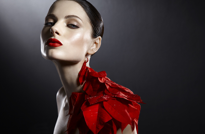
Kevin was able to create a high-end, modern and beautiful shot with his keen eye for lighting and coloring effects. The different shades of red on the poinsettia leaves tie beautifully with the boldness of the models lips. Kevin also brought out the blue of the model's eyes which makes for a subtle natural contrast that offsets the photo nicely since it creates a point of interest. By using 2 different light sources (a soft light from the upper left hand corner and a harder light on the right side of the models face) Kevin was able to capture to curves and edges of the models figure in such a pronounced way that its able to compete for attention with the boldness of the red elements.

Photographer: Covergirl
Location: Unknown

I chose this covergirl shot because of the message it sends. Talia was well known around the world for her battle with cancer. She loved doing make-up and had a YouTube channel on make-up demos. I love the fact that Covergirl didn't plaster her face with makeup to try to cover up the fact that she's bald from the cancer. Instead, Covergirl emphasized Talia's happiness, radiance and the life she had in her. The soft purple eye shadow just brings the slightest amount of attention to the life in her eyes and her light lip gloss makes her smile emphasized just enough to allow the viewer to focus on her genuine happiness. Covergirl was able to capture her character rather than just simply her appearance.