Tuesday, May 5, 2015
Photographer: Unknown
Location: Unknown
Tire tracks on this young girls face really screams to viewers to show some respect for cyclists. Focusing on her face and blurring out the rest of the photo forces viewers to focus on what message is trying to be sent in this PSA. Her being so young appeals to the emotions in a much more intense way than if it were an older adult. Combining childlike innocence with a gruesome message is sure to leave a lasting impression on viewers. The photographer did a good job in giving the photo a more serious tone as far as colors go. The bland colors give a sense of seriousness that accentuates the importance of this PSA.
Photographer: Unknown
Location: Unknown
"She's only 42 and she looks like that?" Making the viewer initially think this will pull them in to take a closer look so that they can figure out what's wrong with this photo. Once you see the cigarette she's lighting from the candles, the message instantly clicks. This ad/PSA combination is particularly powerful because so many people are obsessed with their appearance that seeing this ad will hopefully be a wake up call that says : "if you keep smoking, this is what your 42 will look like." I love that the photographer paid extra attention on accentuating the woman's skin texture. It really solidifies the message that's being sent.
Photographer: Unknown
Location: Unknown
This PSA really throws it in viewers faces just how disgusting doing meth can be. By using such a gruesome photo, it really captures the attention of viewers. Once they read the message, it sends a powerful vibe of why you shouldn't do meth. Since people are so worried about their appearance, this PSA hits the nail on the head on why you shouldn't do meth. I really like the small element that is next to the "You'll never worry about lipstick on your teeth again." It's a great entry point to draw the eye to the message and it doesn't distract from the impact of the photo.
Photographer: Unknown
Location: Unknown
This PSA highlights the fight against domestic violence and sexual assault. All of these NO MORE PSA ads feature celebrities, which creates credibility and allows for a more effective message to be sent through the media since most viewers will recognize the person immediately. The black and white scheme with the blue accents creates a sense of seriousness and importance of the PSA, which is extremely appropriate and effective considering the kind of message this ad is trying to send.
Photographer: James Bastable
Location: Stonnall
James was able to capture the elegance and simplicity of this product by using a dark backdrop against the dark bottle. This shot looks professional, especially with the reflection of the product underneath of itself. The only thing I would work on is the cap of the cologne. It's a little too shiny and glarish, it really takes the attention away from the name of the product. If the cap had softer light like the bottle has on it, I think it would really refocus the viewers attention on the name of the product, which is ultimately what you want when doing a product shot.
Photographer: Insomnia Graphics
Location: Oregon
Retouching a photo can really help brings out the natural beauty that can sometimes be trapped in a natural photo. By highlighting the different tones of the model's skin, there's more color and drama added, she no longer just looks as if she's one shade. By touching up the model's skin, her face has also been given more attention and would now be considered one of the main focus points. Her hair has also been giving a little more life by accentuating the different highlights, tones and shadows that needed a little help showing themselves. The model's touched up skin also helps her separate from the background, which gives the photo a little more depth than it originally had.
Photographer: Redfrost Photography
Location: West Midlands
The photographer for this product shot went with a close up angle in order to show the detail and intricacy of the face of the watch. Having the watch fade on either side gives a sense of professionalism, mysteriousness and elegance. Keeping the watch off center makes the shot more captivating and could also double as a good advertisement if need be. The photographer also did a wonderful job in controlling the lighting. With a light source coming from above and the watch being made of metal, it can be difficult to avoid areas being blown out or having too much of a glare. But the photographer did just fine in tweaking the levels of their lighting. It's just strong enough to give the watch a stylish and business like feel.
Photographer: Lee Morris
Location: USA
Beautiful levels, great angle and awesome lighting. I especially love the lighting in this model shot because it's neither too harsh or to soft. It's just right, and it helps create good texture in the models hair and highlights the tones of her skin. The earring is a nice subtle element that's been highlighted slightly just to create a point of interest without stealing the attention away from the main focus of the model. The only thing I would like to see is more highlights brought out in the models hair and eyes.
Photographer: Alysha Nett
Location: California
Although this photo is too centralized, it helps that the model has her head angled down a bit. It gives more visual interest and takes of the edge of weirdness since she's staring right at the viewer. A rather smooth looking shot, the dots on the models hands and face helps create some kind of much needed texture. The only thing I would suggest for this shot is to back up a little more so that the models elbow aren't cut off and are instead included in the photo. Right now, the model just looks like she has floating arms. They need to be anchored to something to bring back the naturality of the human body. Cut off joints are never good in professional photography.
Photographer: Oldenburgh Photography
Location: Minnesota
My favorite aspect of this photo restoration is the fact that Oldenburgh was able to bring life and focus back into the boys eyes, which gives the viewers eyes a central point to focus on and will help draw the initial attention. I also love how you can see more of the texture on the boys shirt, overalls and hair. The image no longer looks flat since the photo restoration has created a better sense of separation from the boy and the background. Even though this photo isn't a complex one, Oldenburgh was able to add subtle complexity to the after photo by bringing out the shadows and highlights of the boy, which add much more interest than what the before photo had.
Photographer: Kristine Ridley
Location: USA
I love this portrait shot Kristine captured and enhanced. There's tons of texture, depth, movement and emotion. Keeping the background out of focus allowed for a great sense of depth to take over the picture. The model's wind blown hair gives movement to the photo and creates a comfortable path for the eye to follow from left to right. Even though the model is close to being centered in the photo, the movement of her hair allows her to look as if she's slightly off center and standing more to the right, which gives the photo more visual interest. It's apparent that Kristine enjoys color editing, because the model's hair is so complex (in a good way) in the tones and shades of her hair. There are shadows, highlights, lowlights, reds, oranges, and yellows. Kristine captured a beautiful and silly moment in time that incorporates things that every photographer loves to see.
Photographer: Kristine Ridley
Location: USA
Kristine was able to take a very special moment and emphasize the emotion in it. By correcting the colors and working with levels, shadows and highlights, she was able to put more focus on the bride and grooms face, whereas in the before-photo their faces weren't grabbing enough attention. Color editing really allowed for more emotion to show through since we can now better see the looks on the models faces. The environment of the photo also now has a more magical, warm feel to it whereas it didn't before. I especially love the color editing on the leaves that are up close and out of focus. Kristine utilized this small element to her advantage and created a more lively feel in the after-photo.
Photographer: Thomas Leth-Olsen
Location: Hamar, Norway
Divergence can sometimes be tricky to capture, but Olsen has done a beautiful job in the most simplest way possible. To me, this photo says "take the road less traveled." Olsen captured the shot at just the right time when a light dusting of snow covered the curved tire tracks, representing that not everyone takes that path, such as the straight tire tracks that are completely cleared of snow. It's the simple things that can be the most impacting, and Olsen was able to combine a big message with an easy-to-understand shot.
Photographer: Candy Kennedy
Location: Studio
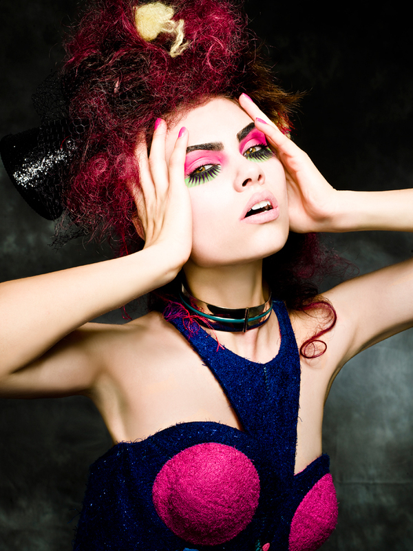
With such a bold choice of colors, makeup, hairstyle and outfit, this photo is packed with visual interest that is sure to draw the eye. Even though this photo is striking on it's own, I chose it because the model has her hands in the photo. Incorporating your arms/hands in a model shot is a great and natural looking solution to increase interest. It adds more content for the viewer to take in and examine and adds complexity without actually getting too complex and busy.
Photographer: Antonio Mendoza
Location: Unknown
I love that Mendoza created visual interest with the background but it's subtle enough to not take away the attention from the products. The faded Banana boat logo in the background reinforces the brand and has the potential to subconsciously imprint itself into the viewers mind. Though I like the subtle elements in the background, I think this product shot could do without the "light streak" (or whatever it is) that's to the left of the products. The faded logo in the top right and the left side (it's larger) of the shot is enough to create an effective element. The "light streak" just seems unnecessary.
Photographer: Taryn Ward
Location: Unknown
I'm not sure if I'm a fan of the bulls eye circles around the product. It seems too harsh and seriously distracts from the product itself, which is a huge problem when you're doing a product shot. The black circles draws your eye away from what's important and creates a distracting visual that steals the focus from the product. If Ward still wanted to use something similar to the black circles to create visual interest, I would create the same black half-circle element that's on the product and surrounds the brand name. At least that way it wouldn't look so out of place and the elements would tie together more nicely than the harsh black circles.
Photographer: Brenton Cleeland
Location: Unknown
This product shot isn't the greatest. It doesn't look appetizing or appealing, and certainly doesn't make me want to drink the soda. For starters, the name "Coca-Cola" should be what's highlighted. Coca-Cola is widely known for their soda, so people will understand right off the bat what this product is when they read the name. I'd also give the product a little more headspace and the background could stand to be a white instead of a poorly lit gray. The top of the can is a little too dark and that glare on the 3 of the "375 mL" is quite distracting.
Photographer: Arne Roslund
Location: Florida
Being able to re-create sections of a photo is amazing; it brings back the integrity and vitality of the photo, and is able to create more visual interest for the person who has the memory of the moment. The original photo is in terrible shape, so it must have been tough trying to recreate the areas of her hair and dress. Her dress looks a little on the fake side, but I suppose the photographer did the best they could do considering the old photo had no reference to the dress since it's so damaged. The photographer did a wonderful job of making the woman's skin more radiant and lively as well as bring out her beauty and whitening her smile. It almost looks like a modern day photo with a simple vintage filter over it.
Monday, May 4, 2015
Photographer: Scott Hancock
Location: Utah, U.S.
This photo restoration is stunning to say the least. Scott was able to enhance an older moment in time, while still keeping the integrity of the memory intact. Getting rid of the tear going straight through the middle of the photo was the biggest eye sore to take care of, and Scott did it flawlessly. There's no trace of the tear ever being there, and now we can see the little kids face clearly. The weird white smudges on the photo were also a much unwanted element, Scott smoothed it out completely while still keeping the pattern of the house the same and saving the father's face. After a little work with levels and shadows/highlights, this photo was given new life after the washed gray scheme of the old photo was replaced by the more eye-catching and satisfying combination of whites, blacks and grays in the newly restored photo.
Photographer: Chris Havron
Location: United States
The way that Havron arranged the shoes strengthens the idea of casualness and a laid back lifestyle while still keeping a hint of class and stylishness. His use of light easily captured the texture of both the side and the bottom of the shoe, helping the product look more realistic and detailed. Even though it's a light colored shoe, I'm glad Havron went with a white background. To me, it accentuates the feeling of "fresh style" in a lightweight, casual sneaker and makes the product as a whole look sharp and clean.
Photographer: Gord Heatley
Location: Unknown
I love how dainty and light this photo feels. This fragrance is definitely a classier one, and Heatley was able to capture that feeling of freshness and elegance that this perfume gives. His use of light and the way he has the perfume angled gives a sense of light and airiness combined with a rich, fresh look. The addition of the gold chain as an accent piece helps bring out the yellow/gold color of the perfume, which strengthens the sense of high class, richness and elegance.
Photographer: Charley Wood
Location: Edinburgh
Even though the subject of the photo is off center, it still is able to capture the viewers attention because of the color contrast: the red of the wine and the green of the background. It really highlights and accentuates the deep, rich red and maroon tones of the bottle, wine and grapes. The shade of green chosen for the background is soft enough to not overwhelm the contrasting red but it's strong enough to compliment the wine nicely.
Photographer: David Heisler
Location: Unknown
Even though this model shot is in black and white, the use of lighting allows for a great visual of texture in her hair and shirt and the angles and contours of her face. The use of the lighting also brings out a wide range of whites, blacks and grays which allows the photo to have more depth and visual interest and avoids looking completely flat. I'd like to see a little more detail on the model's nose though; it's a little too white and is getting slightly blown out. Also, the small part of the top of her head being cut off is quite annoying. I'd re-shoot with the same model and pose but just move the camera up a little more in order to give her a nice amount of headspace.
Photographer: Kevin Kozicki
Location: Los Angeles
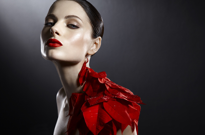
Kevin was able to create a high-end, modern and beautiful shot with his keen eye for lighting and coloring effects. The different shades of red on the poinsettia leaves tie beautifully with the boldness of the models lips. Kevin also brought out the blue of the model's eyes which makes for a subtle natural contrast that offsets the photo nicely since it creates a point of interest. By using 2 different light sources (a soft light from the upper left hand corner and a harder light on the right side of the models face) Kevin was able to capture to curves and edges of the models figure in such a pronounced way that its able to compete for attention with the boldness of the red elements.
Photographer: Covergirl
Location: Unknown
I chose this covergirl shot because of the message it sends. Talia was well known around the world for her battle with cancer. She loved doing make-up and had a YouTube channel on make-up demos. I love the fact that Covergirl didn't plaster her face with makeup to try to cover up the fact that she's bald from the cancer. Instead, Covergirl emphasized Talia's happiness, radiance and the life she had in her. The soft purple eye shadow just brings the slightest amount of attention to the life in her eyes and her light lip gloss makes her smile emphasized just enough to allow the viewer to focus on her genuine happiness. Covergirl was able to capture her character rather than just simply her appearance.
Monday, March 16, 2015
Photographer: Darko Vojinovic
Location: Unknown
This dark, mysterious photo captured by Vojinovic gives a dangerous feel. Because of the anonymous people, it forces the viewer to focus more on what the situation of the photo might be rather than who it's about. The light source gives a dramatic appearance and enforces the fact that it's night. The angle at which he captured the photo allows for a good sense of depth based on the shields and better quality texture ofirst the rubble on the ground. The side profile shot of the man In the corner looks somewhat flat, but still works in this composition.
Photographer: "Scorpio Entity"
Location: Tineretului Park, Bucharest
This is a great idea for a vertical panoramic shot, but I'd like to see it a little wider. Things in the photo look extremely squished and are in need of some breathing room. The color editing is also quite dramatic and looks great on the pavement, trees, and the orange area of the sky. The grey clouds however, seem way too fake looking. The texture is unnatural and really distracts from the rest of the photo.
Photographer: Hiacynta Jelen
Location: Frankfurt
I've heard before that have something cut down the center of any kind of design is automatically labelled as "bad design." Sometimes I disagree with it, but in this photo's case, I would've liked to see the cityscape panoramic without the bridge cutting right down the middle. It's quite distracting and takes away from the beauty of the cityscape, the colors reflecting off the water, and the texture of the sky. Perhaps if the underside of the bridge was lighter at the start and then faded into black, it would better convey distance and not be so terribly distracting.
Photographer: Russ Burden
Location: Montana
By bringing out the purples, oranges, reds and blues and darkening the rest of the landscape, Burden is more easily able to convey the idea of twilight or evening. It's warm an inviting but also gives a sense of peace and ending. Capturing the trees and the mountain in the background help give the photo distance, and the buffalo's reflection in the water gives the idea that the world is transitioning into a new one because of the evening settling down. Making the fog more prominent is a nice touch, but I'd like to see it surrounding the rest of the buffalo and the area of water he's standing in to give a more mysterious vibe. In the coloring editing process, Burden was also successful in keeping the natural texture of the water without it getting too distorted.
Photographer: Russ Burden
Location: Colorado
This landscape photo by Burden is a great combination of a panoramic shot and color editing. He allows the trees to pop more and create a better sense of depth in the photo, since "light" comes forward. He was also able to bring out the shape of the moutains by lightening up the bluish fog that surrounds them. By giving a warmer feel to the trees, we was able to combat the cool, bluish tint of the moutains and the water.
Saturday, March 14, 2015
Photographer: Bassam Hammoudeh
Location: United States
The amount of texture in this photo allows for great depth throughout the rather simple composition. In a photo as simple as the one above, it can be tough to be successful in keeping the texture and depth intact. But by bringing out the coppery reds and tans of the fox and slightly blurring the background, Bassam was able to convey distance and avoid looking flat. There are some areas on the fox where the whiteness is slightly blown out, but that's nothing a little levels work can't fix.
Photographer: Marvin King
Location: Kalamazzo County, MI
Typically, raspberries all look the same. But with a little color correction and shooting in the right light source, photographers like King are able to capture all the different hues and levels of saturation. He was able to depict pinks, purples, maroons, and reds. The only thing I would recommend for this photo is to move the camera up a little more so that the pure black wasn't showing through at the bottom. It almost distracts the viewer and takes the attention away from the vibrance of the raspberries.
Photographer: Seth Casteel
Location: Venice, CA
Capturing fast motion photography can be tricky, but Casteel has it down to a T. The level of clarity he is able to capture is astounding. His ability to color edit the photos so that the dogs and the objects don't have a blue tint from the water is a beginners trick that he utilizes to its full potential. The water in the background and the pool steps/wall gives the photo great texture and allows for better depth perception between the dog and the background.
Wednesday, March 11, 2015
Photographer: Pawel Uchorczak
Location: Poland
Pawel does a wonderful job in avoiding blowing out the lighter areas of the photo and still keeping the colors in the darker areas. He gives a good sense of depth and distance with the angle of the shot and the level of effort he put into tweaking the highlighting and shadows. Yellowing up the beams of light that fall on the earth gives a much more "godly" feel, as if it's almost portraying that light always overcomes dark or as if the earth is waking up.
Photographer: Mohsen Oliaei
Location: Tehran, IR
This isn't the best quality photo, but I just had to post something from one of my favorite photographers. He creates darker, vintage shots in which his goal is to pull the viewer in to make them think about things in their life. Living in such a hectic world with busy days and tight schedules, his photography pulls me into simpler areas of thought. He creates a serene feel. Coming home from a long day, I always look through his Instagram account to help wind down and reflect on things. Since his photography is all on Instagram, it makes accessibility easy, especially when we live in a world where cell phones are practically glued to our hands.
Monday, March 9, 2015
Photographer: Kevin Russ
Location: Unknown
Russ is one of my favorite photographers: his ability to capture free spirit, nature and an ongoing journey creates a story in each photo. The texture is phenomenal; from the wolf's fur to the branches and twigs on the ground, it helps in adding depth to the photo. I would perhaps try to lighten up the trees that are getting a little dark in the back. They're beginning to lose their texture. By brightening up the trunks of the trees, more attention can be brought to the texture of the bark and not make it look so flat.
Wednesday, March 4, 2015
Photographer: Chris Stern
Location: Unknown
Known for his black and white architecture-based photography, Stern is able to capture photos of wonderful perspective and enormity. Being in black and white, this photo is accentuated in how tall the building actually is. The brighter center of the photo aids in helping the eye capture perspective easily (how the building shoots upwords.) The dark arch in front of the building helps balance out the bright negative space of the sky and ties in well with the white shades on the building.
Wednesday, February 25, 2015
Photographer: Michel Rajkovic
Location: Greece
The texture difference between the water and the rocks is phenomenal. The black and white theme aids in highlighting the softness of the water and the hardness of the rocks. This photographer has a knack for creating ghostly landscapes that are both captivating and frightening. The opening in the rocks gives the sense of the "unknown" in the world, which is both exciting and scary at the same time. Some of the areas on the rocks are a little blown out and the center of the photo (in the water) is somewhat bright. I would play with the adjustments of the levels in this photos so that the midtones are more dominant that the shadows or highlights themselves.
Monday, February 23, 2015
Photographer: Marty Knapp
Location: Giacomini Wetlands Trail
Foliage/Nature shots are always beautiful in black and white. The whiteness of the plants almost look as if they're illuminated and glowing, which adds a mystical feel to the photo. The dark tree branches create a natural frame that help hold the composition together. The light source creates a slight divide between black and white on the left and right side of the photo, while in the center it comes together in mutual shades of grays, blacks and whites which connect the left and right side of the photo. This photo would look good in full color, but I feel it would lose its charm that the black and white theme gives the composition.
Photographer: Paul Politis
Location: New York City
What drew me to this black and white photo is the obviousness of the light source. Being in black and white, the light source is accentuated when it hits the sides of the buildings which helps add depth and height to the photo. It gives the viewer the sense of feeling small when looking at these buildings. Being in black and white helps highlight their enormity. The photo is also kept in a simplistic black and white color scheme since there are 3 main shades: the dark side of the buildings, the light side of the buildings, and then the gray of the sky. Simplicity enhances focus on the buildings and the viewer's eye won't get so distracted trying to pick out hundreds of different shades of whites, blacks and grays.
Sunday, February 22, 2015
Photographer: Cole Thompson
Location: Devil's Tower, Wyoming
Though it's daylight, Thompson did a great job in creating this black and white photo without blowing out the sky. Having the sky darkened adds for greater contrast against the clouds and Devil's Tower. The trees at the bottom of the photograph loose a great deal of detail, a downside to being in black and white. It could also be a good thing, however, because it allows for more focus on the main subject of the photo itself: Devil's Tower. My favorite part of this black and white photo is the vast amount of negative space the sky gives. It's beautiful and almost seems like it has a hint of a gradient to it as the sky meet the clouds. An all around great shot. with great balance between the heaviness of black and the lightness of white, with the right amount of grays in between to add visual depth to this photo.
Photographer: Cole Thompson
Location: Death Valley, California
This black and white photo shares the same eerie, foreboding feeling that the location of it gives. Being in black and white, the photographer puts emphasis on the road, making it as alluring as possible. I would perhaps try to darken the sky a little more so that is doesn't battle for attention with the lightness of the road. Simple and captivating, having this photo in black and white gives the viewer a feeling of stepping into another world and only being able to go down one path. The mountains off in the distance with the road disappearing over the hill gives a sense of mystery and curiosity.
Photographer: Hugh Honeyman
Location: Unknown
I chose this picture because it stood out to me as a good composition, but bad choice of using a greyscale, black and white theme. This photo is too busy to be in black and white, it's starting to look cluttered and it's difficult to separate one object from the next. If it were in color, the viewer would have an easier time determining all of the separate parts of this metro shot. The photographer could have at least made the contrast heavier in this shot to help get rid of all of the grayer tones that are making this shot so mashed up.
Thursday, February 12, 2015
Photographer: Shane Gross
Location: Somewhere off the East Coast
Not my favorite shot, simply because it's somewhat boring to me. Black and white can add drama to the right shot, sure, but I think I would rather see this shot in color with the whale being its true gray color surrounded by its blue environment. However, I do enjoy the texture of the whale that's brought out by the blacks, whites and grays. It's as if it defines the texture more so than a color shot would.
Photographer: Tom Millea
Location: Unknown
Stark contrast is created in this photo by Tom Millea. From the foggy sky to the dark corner of the forest, this photo boasts a comfortable balance between light and dark, black and white. Having this photo in black and white helps create division between the 2 subjects while also unifying them at the same time. Neither side looks too empty or heavy, the dark and light balances each other. If this photo were in color, I don't believe the same effect of perfect balance would be created. It's being in black and white is what makes it.
Wednesday, February 11, 2015
Photographer: Unknown (from http://www.villafranceprovence.com/)
Location: French Riviera
This photo of a horse being in black and white allows for greater definition of the muscles and texture of its mane/body. It adds drama and intensity. However, the horses mouth, belly and eye gets somewhat lost in the extremely dark background. I would try to focus on the levels of these areas by playing around with the highlights to bring a little more definition to these parts of the horse.
Photographer: Sally Mann
Location: Unknown
This photo by Sally Mann reminds me of the phrase, "monkey-see, monkey-do" in the sense that children will follow in the footsteps of their parents. The child's pose and expression reminds me of a middle aged woman who seems unhappy with her life. With this photo being in black and white, you can see the subject focus is put intently on the girl, her "cigarette" and the floating figure in the back which gives a feeling of a hanging corpse. This photo plays with innocence being contaminated and a sense of morbidity and death. Having such strong highlights and deep shadows helps keep the girl on the right out of focus so that she doesn't take the attention away from the main part of the photo: the ties between the girl, her cigarette and the floating corpse.
Subscribe to:
Posts (Atom)